
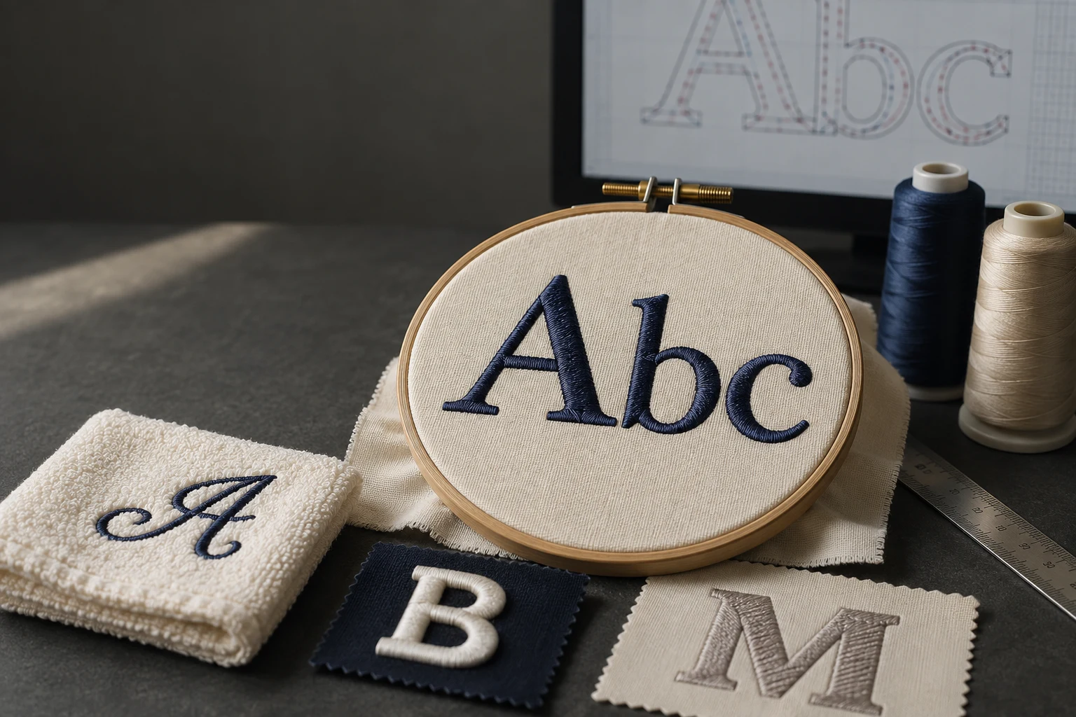
Cover image: AI-generated editorial concept; not a customer project or production proof.
To digitize letters for embroidery, set the finished size and fabric first, choose a suitable embroidery font or build the letter shapes as stitch objects, then adjust spacing, stitch types, connections, underlay and compensation. Preview the stitch sequence and test the lettering on the intended material before production.
A readable name on a polo, a script monogram on a towel and bold lettering on a jacket need different decisions. These ten considerations explain what to check across those applications.
1. Choose letter shapes that can hold their detail
Start with the exact wording, capitalization and intended appearance. Inspect thin strokes, small serifs, tight curves and the openings inside letters such as a, e and B. Consider a simpler block font for your first sample because it gives you fewer delicate details to resolve.
An embroidery alphabet provides a useful starting point. A TrueType font supplies letter shapes, but those shapes are not necessarily optimized for stitching. Hatch explicitly recommends test stitching TrueType lettering and provides recommended size ranges for its embroidery fonts. Hatch’s font guidance.
For custom artwork, decide which details must remain exact and which can be simplified. Get agreement before changing a distinctive letterform in a wordmark.
2. Set the reference height and overall dimensions
Keep three measurements separate: the letter height, the width of each stitched stroke and the dimensions of the complete word. A tall, thin letter can still have a stroke that is difficult to embroider.
Use an uppercase H or E as a practical visual reference from the baseline to the capital height. Check the complete wording separately: lowercase g and y may extend below the baseline, and accents may increase the overall height.
Hatch’s recommended font heights refer to uppercase letters. Lowercase characters can be substantially shorter, so the selected height does not describe every character in a mixed-case name. Stay within the font’s documented size range and inspect the smallest characters. Hatch’s lettering size guidance.
For buyers and decorators in the US, Canada and UK, record dimensions with explicit units. For example, a requested overall width of 3 inches is 76.2 mm. State whether that measurement applies to the whole design or only the text.
3. Balance letter spacing and width
Judge spacing by the visible gaps between shapes. Equal numerical spacing can look uneven around combinations such as AV, To and II. Review individual pairs as well as the complete line.
Leave room for internal openings and separation between adjacent letters. Avoid squeezing a long name into a fixed width without rechecking its smallest strokes. If the wording no longer fits comfortably, consider a larger placement, a different font or a second line.
Confirm spelling before refining spacing, especially when preparing multiple personalized names.
4. Plan joins, connectors and sewing order
The join method determines how stitching travels between letters. Closest join connects nearby points and can reduce trims. Some fonts use an “as digitized” method to preserve their original construction, including special stitch combinations. Keep the font’s intended method unless you have a reason to change it. Hatch’s lettering join documentation.
Where software offers a baseline or bottom join, inspect the resulting connector rather than assuming fabric pile will hide it. Likewise, a short connection between script letters may be acceptable within a joined stroke but conspicuous across an open gap.
Preview the sewing sequence with connectors visible. Check where each letter starts and ends, whether travel crosses exposed fabric, and where a trim is needed. Reducing trims is useful only when the visible lettering remains clean.
5. Reshape letters at their final size
Treat reshaping as a way to improve stitchability while preserving recognition. You might open a cramped counter, simplify a flourish or make a thin stroke slightly wider. Work at the intended production size so you can assess the effect on the whole word.
Embroidery software can change object outlines, stitch angles and entry or exit points through control-point editing. Tight turns also deserve attention because stitches can crowd along the inside edge. Hatch’s definitions of control points and stitch shortening.
Keep an editable master before making these changes. Review the regenerated stitches after resizing or reshaping, then sew another sample if the change affects the finished lettering.
6. Match stitch type to the letter construction
Choose stitches according to the stroke width and intended texture. Satin is a common starting point for lettering, but other constructions have useful roles. Hatch supports satin lettering and alternatives such as tatami fills; Wilcom also offers dedicated run-stitch alphabets. Hatch’s lettering stitch effects, Wilcom’s lettering categories.
Stitch type | Useful lettering application |
|---|---|
Satin | Smooth columns with a directional sheen; check column width against the font and machine requirements. |
Tatami or fill | Broad letter areas where a textured fill suits the design. |
Run stitch | Deliberate single-line lettering or outlines, using a font designed for that appearance. |
A run-stitch letter is a different visual style, not an automatic repair for a tiny solid letter. Avoid treating one satin-width limit as valid for every machine, thread and font.
7. Choose underlay for the strokes and fabric
Underlay is the supporting stitching beneath the visible surface. Start with the font and fabric settings, then check whether the support suits the actual stroke widths.
Hatch’s lettering guidance describes center-run and edge-run underlay for ordinary lettering columns, with additional support possible for large lettering such as jacket backs. Its size-based suggestions are useful starting points, but the software also allows adjustment for fabric, shape and appearance. Hatch’s lettering underlay guidance, automatic underlay settings.
Inspect the sample for underlay peeking outside the top stitches or creating bulk in narrow strokes. On textured fabrics, assess whether the lettering remains clearly visible. Underlay, backing and topping work together; changing only one setting may not resolve the problem.
8. Treat 3D puff lettering as a separate construction
Foam lettering requires a design prepared for foam. Simply placing foam beneath a flat lettering file does not establish the necessary stitch structure.
Hatch’s foam tutorial uses satin columns, tack-down stitching and capped ends to contain the foam. It switches off ordinary underlay over the foam to avoid flattening it and uses closer stitch spacing than its standard flat satin setting. Its example specifies 0.16 mm, which should be understood in the context of that tutorial rather than applied to every foam project. Hatch’s 3D puffy foam tutorial.
Choose a foam-compatible alphabet or have the letters specifically constructed for the effect. Test with the intended foam, thread and garment, checking end coverage and whether the excess foam separates cleanly.
9. Adjust compensation from the stitched result
Fabric can pull inward as stitches form. Pull compensation extends stitches beyond an object’s outline to help counter that narrowing. Backing, topping and underlay also contribute to controlling distortion. Wilcom’s explanation of pull compensation.
Wilcom lists 0.2–0.3 mm as a lettering guideline, while explaining that suitable settings depend on fabric, hooping and object size. Use it as a reference for testing, not a universal prescription. Wilcom’s compensation settings.
Compare the sample with the intended stroke widths, baseline and gaps. Avoid increasing compensation across the entire word when only one section needs adjustment; extra width can also crowd neighboring letters.
10. Understand density and approve a sew-out
Check how your software expresses density. When the setting is stitch spacing in millimeters, a smaller number places stitches closer together and increases density. A larger spacing value produces more open stitching. Hatch’s stitch-spacing definition.
Begin with the appropriate font and fabric settings instead of assigning one density to every letter. Wilcom identifies density, underlay and pull compensation as fabric-dependent parameters, so a file prepared for one material may need changes for another. Wilcom’s fabric-specific lettering guidance.
Sew the actual wording at its final size using the intended fabric, stabilizer, needle and thread. Examine it after removing it from the hoop. Check readability, open counters, spacing, surface coverage, puckering and exposed connectors. Record changes and repeat the sample when needed.
Save the editable design and export the format required by the receiving machine. A machine stitch file contains stitch coordinates and machine functions, so retaining the design master is useful for later revisions. Hatch’s design and machine-file definitions.
What to send when ordering lettering digitizing
Prepare the exact text, artwork or font reference, overall dimensions, garment material, placement, thread details and required machine format. Specify flat or foam lettering and identify any details that must remain unchanged.
For a set of personalized names, include the full list and ask how longer names will fit the available space. Agree on the sample review process before the production run. You can review DigitEMB’s embroidery digitizing services when preparing that brief.
Frequently asked questions
Can I use any computer font for embroidery?
Some embroidery software can generate stitches from TrueType fonts, but not every font is suitable at the requested size. Inspect thin details and test the result; an embroidery alphabet with a documented size range is a useful starting point.
What is the smallest readable embroidery letter?
There is no single minimum that applies to every font and material. Follow the alphabet’s recommended size range, check lowercase characters separately and approve a sample using the intended production setup.
Can I use the same lettering file on a polo and a towel?
Do not assume the same settings will work equally well. The fabric texture and support requirements differ, so review underlay, density and compensation and test each material.
Does adding more stitches make letters clearer?
Not necessarily. Readability also depends on shape, spacing, support and stitch construction. Check those factors before increasing density.